It’s the start of a new semester and we all knew that we were going to have to collaborate with fashion design students but today we were also informed about our theme. Honestly, I want to drown myself after knowing the theme However, its “NAUTICAL” we are supposed to make a jumpsuit for ladies.
We, graphic designers, will be working mostly with pattern making and helping them with color theory, print etc.
How I usually start my research is, I come up with the vocabulary terms related to the topic.
WEEK 2
I have been looking at different patterns especially in our culture Pakistan there are very unique and beautiful patterns seen in apparels and even in architectural buildings.
I found this beautiful and playful website which has beautiful patterns.
and a tutorial for patterns in photoshop
WEEK 3
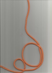
We have finally decided on our patterns and for me, I realized I have mostly vector designs rather than restored images but my vectors are pretty dope too. I basically took some elements from Qatar buildings and Palestinian patterns and nautical themes As for raster images I scan ropes in different ways.
WEEK 4
so far I have made these patterns
These are my finals patterns as spot, repeat and engineered.
PROJECT 2
Movie #1
Movie: Fight Club Year of Release: 1999 Genre: Drama/ Action Director:David Fincher Producer: Cean Chaffin, Art Linson & Ross Grayson Bell. Studio: Chapman/Leonard Studio Equipment. Main Characters: Brad Pitt, Edward Norton & Meat Load Score Plot / Main Action: A depressed man (Edward Norton) suffering from insomnia meets a strange soap salesman named Tyler Durden (Brad Pitt) and soon finds himself living in his squalid house after his perfect apartment is destroyed. The two bored men form an underground club with strict rules and fight other men who are fed up with their mundane lives. Their perfect partnership frays when Marla (Helena Bonham Carter), a fellow support group crasher, attracts Tyler’s attention. Pragmatic – Poetic – Persuasive
Movie #2
Movie: Inception Year of Release: 2010 Genre: Science Fiction/ Thriller Director: ChristopherNolan Producer: Christopher Nolan & Emma Thomas Studio: Warner Bros Main Characters: Leonardo DiCaprio, Tom Hardy, Joseph Gordon-Levitt Score/Soundtrack: Plot / Main Action: Dom Cobb (Leonardo DiCaprio) is a thief with the rare ability to enter people’s dreams and steal their secrets from their subconscious. His skill has made him a hot commodity in the world of corporate espionage but has also cost him everything he loves. Cobb gets a chance at redemption when he is offered a seemingly impossible task: Plant an idea in someone’s mind. If he succeeds, it will be a perfect crime, but a dangerous enemy anticipates Cobb’s every move. Pragmatic – Poetic – Persuasive
Movie: Bol Year of Release: 2011 Genre: Drama/ Thriller Director: Shoaib Mansoor Producer: Shoaib Mansoor Studio: Shoman Productions Main Characters: Manzar Sehbai, Atif Aslam, Iman Ali, Mahira Khan, Humaima Malik. Score/Soundtrack: Plot / Main Action: Zainub Khan has been found guilty by Pakistan’s Courts and is to be hanged. Her last wish is to tell her story before the media, and after approval, she relates how her family was compelled to leave Delhi during 1948 and relocate to Lahore. This is where her father, Hakim Sayed Hashmutallah Khan, married Suraiya, and hoping to sire a son, instead ended up with 7 daughters. The 8th child turned out to be a hermaphrodite and Rahmatullah wanted it dead but Suraiya insisted that she will not let anyone know so as not to shame her husband. They named the child Saifullah and hired a tutor to teach him at home. After a failed marriage, Zainub returns home, notices that the tutor was molesting her brother and asks him to leave. With dwindling income from his father, unable to attend school, his mother giving birth to still-born babies, his siblings uneducated, Saifullah is then himself compelled to seek employment. It is here he will be sexually molested and subsequently killed by his father, who bribes the police by embezzling Rs.2 Lakhs from the Masjid where he presides as a Khajanchi. In order to return the money to the Masjid, he starts to tutor children of prostitutes with the help of Saqa Kanjar. When their neighbor’s son, Mustafa, proposes marriage for his daughter, Ayesha, he refuses, as they are Shiah, and plans to marry her to a much older male. Things will change rapidly when Saqa will make a proposition that will change everyone’s lives forever. Pragmatic – Poetic – Persuasive
Movie: Maquia: When the Promised Flower Blooms Year of Release: 2018 Genre: Drama/Fantasy Director: Mari Okada Producer: Naoko Endo, Tomomi Kyotani, Nobuhiro Takenaka, Takahiro Kikuchi Studio: P.A. Works Main Characters: Manaka Iwami, Miyu Irino Score/Soundtrack: Plot / Main Action: An immortal girl and a normal boy form a bond which lasts for many years. Pragmatic – Poetic – Persuasive
Movie: Insidious Year of Release: 2010 Genre: Drama/Mystery Director: James Wan Producer: Jason Blum, Oren Peli, Steven Schneider Studio: Blumhouse Productions Main Characters: Patrick Wilson, Rose Byrne & Barbara Hershey Score/Soundtrack: Plot / Main Action: Parents (Patrick Wilson, Rose Byrne) take drastic measures when it seems their new home is haunted and their comatose son (Ty Simpkins) is possessed by a malevolent entity. Pragmatic – Poetic – Persuasive
PROJECT 2- MOVIE POSTER
WEEK-1
This project sounds super exciting because I am a movie nerd, but when they included the 3 modes of design. I got so confused and totally forgot about them. I had to search the modes and understand them again. I still don’t know how I will apply it to the movies I choose.
These literary devices are pretty self-explanatory but I still have my doubts and I feel like I don’t understand them.
found this dude explaining the term.
WEEK 2
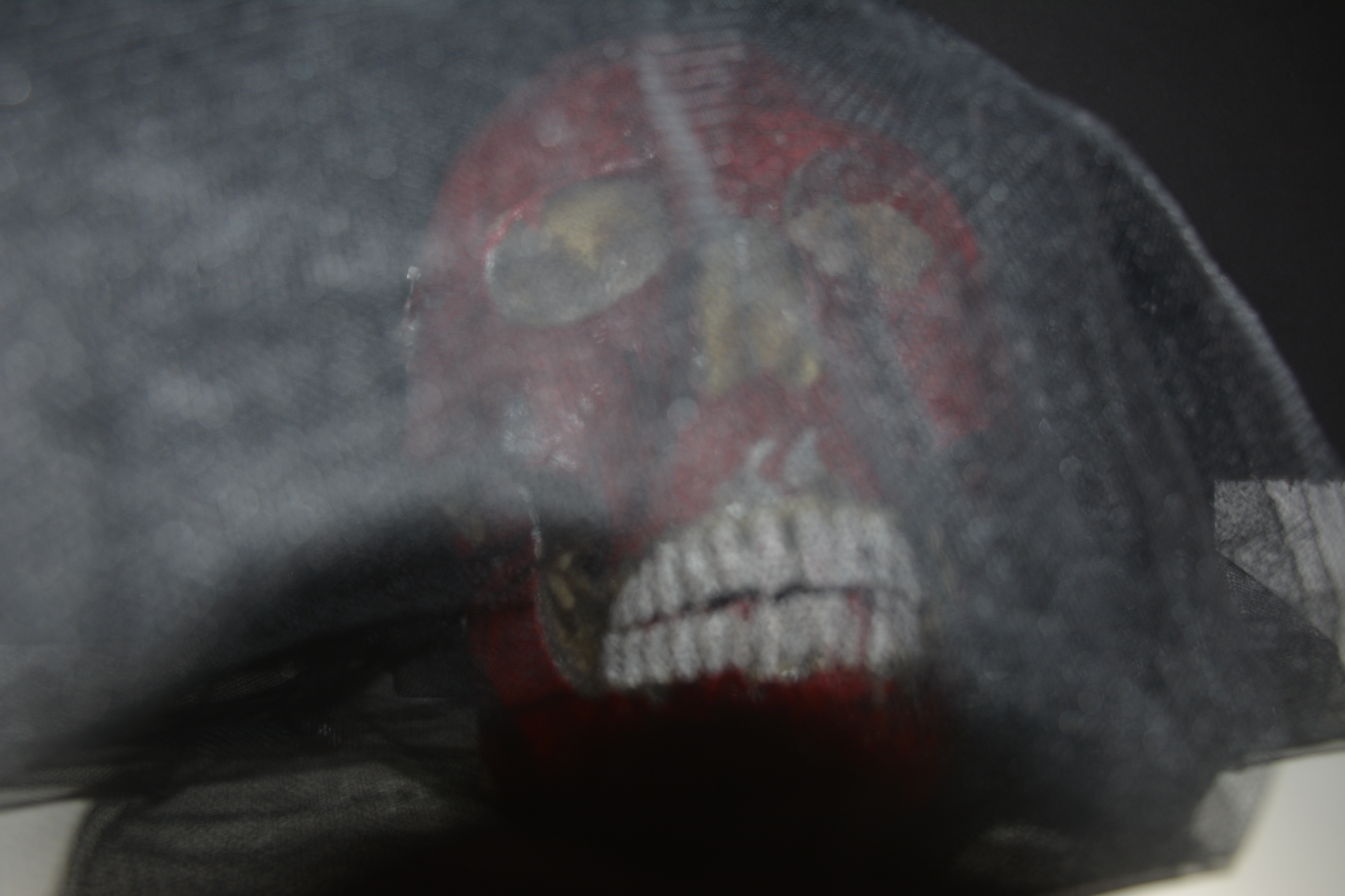
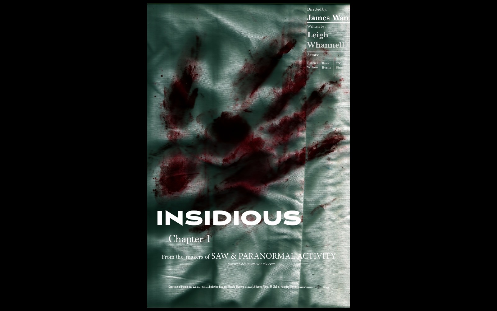
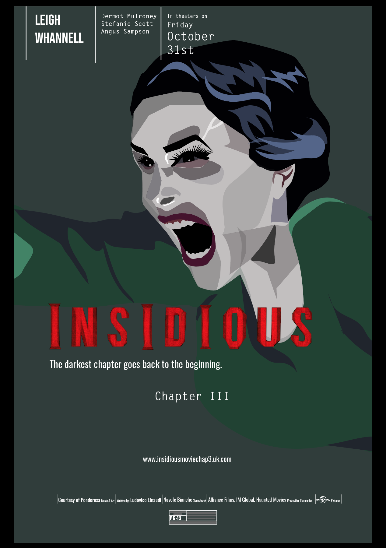
I choose the movie Insidious. It actually just slipped from my mouth 😛 before I could not decide which one to choose because there are so many options, However, I think this movie was good and I remember watching it alone by myself in my room.
I had to rewatch the movies again to get some elements from them to use for the poster because without them I could not decide what to use for the poster.
I took a couple of images and scanned some stuff to use because I think the poster looks empty without the photos and I don’t want it to be just a vector.
WEEK 3
I started with the type placement but it is so hard to find a good type for the title. The polish posters helped me figure out a good placement for the type but it’s hard to find a good typeface. I don’t want to give it all away that its scary and the typeface needs to be gothic.
My illustrator drop eye tool is not working so my vector is super bad. It’s always something with the illustrator.
WEEK 4
thinking to make my own but I need a lot of time for this.
Even better Leland gave me tapes to make the title and it looks so much better. I learned that I was playing with so many types. I choose the best ones to go with the poster.
PROJECT 3- MOVIE POSTER/ TITLE SEQUENCE
WEEK 5
I am super excited about this project. I always wanted to try bit or basics of film-making. In the class we were shown title sequences and I have some of my favorite title sequences I think I could take inspiration from for this project.
Orphan- End Credits
I love the use of neon colors to show little bit of the movie, Since its end credits they did not bother revealing the technique of hidden neon colors (which play an important part) used in the movie.
Unfortunately, I cant use this as it is not from the same movie 😦 </3
Insidious title sequence 1
The only interesting thing I found from Insidious title is that they start showing the frame from 360 angle and smoothly shows the interior of the house. The titles are also kindaf interesting because they vanish into a smoke but thats about it.
Insidious – title sequence 2
WEEK 6
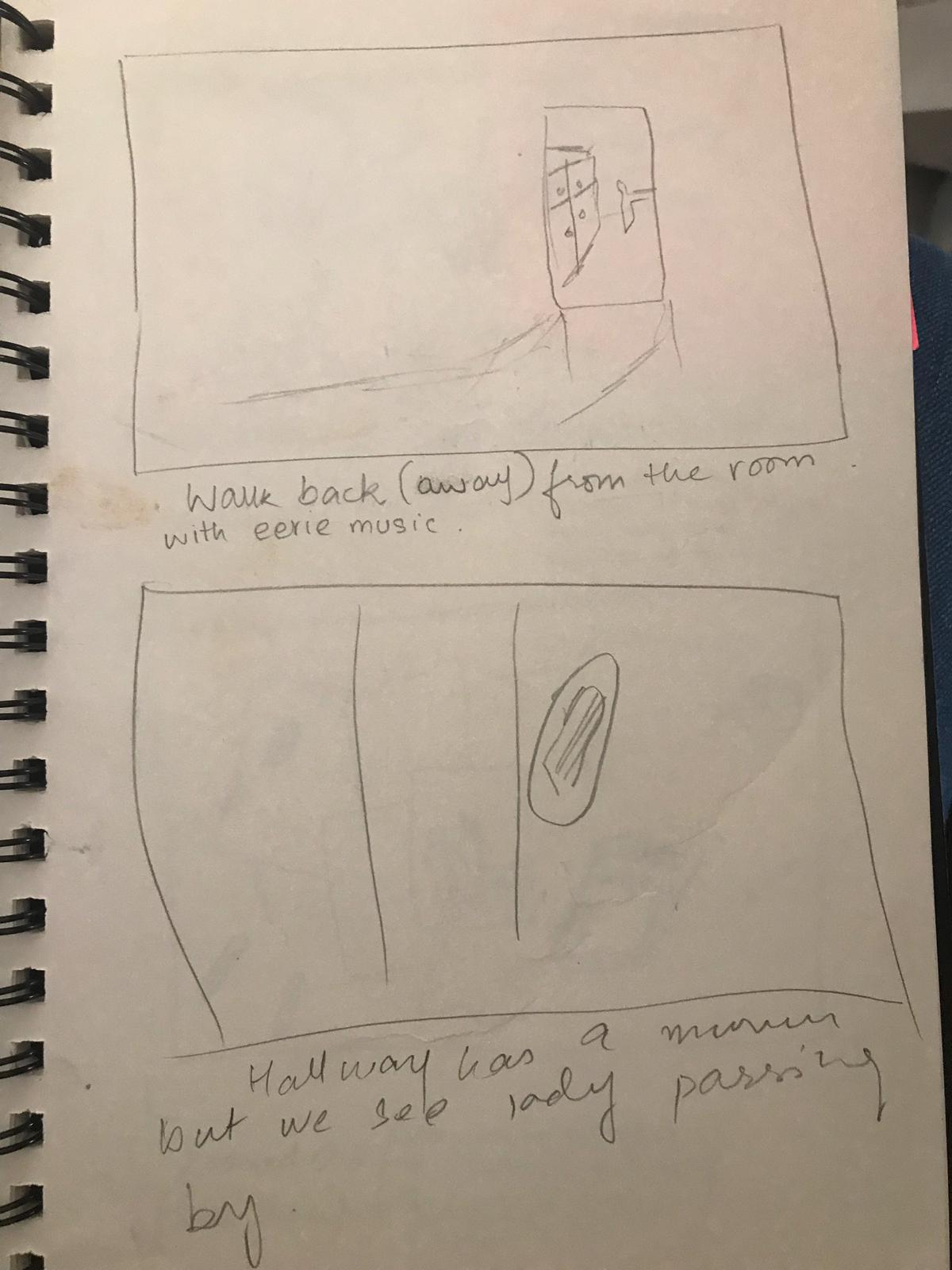
We were said to make story board for our film.
okay my sketching sucks a** …. 😳but I am good with what I want to show. I will show a kids room and while shifting I will show the ghost in either reflection or as a shadow as I don’t want to give much of it.
WEEK 7
I fixed my story boards as Leland said me to give more details.
WEEK 8
I think my story board is strong and I have all of my props.
The first week started with a lot of papers and information that one could take in also knowing that it was a collaborative project, gave me a mini heart-attack.
I had a slight idea about branding from a business point of view but did not think about it from a design perspective.
To get more knowledge about branding I surfed through the internet.
WEEK 2:
For our next step, we are supposed to have a field trip to Lagoona mall and look around to analyze different lifestyle and identity of the stores.
I choose Ted Baker and 51 east same as my friend, to already get the vibe of working in a group.
I noticed the following points about Ted Baker retail store:-
Generic Style
Dim Lighting that goes well with the apparel theme.
Closely spaced
Sparkling/ Shine glassing
Logo- shows its lifestyle (which is classy and chic)
Speaks dramatic life
Color palette – Pink and Brown
Consistent style
Wordmark – bilingual (in both Arabic and English)
Elegant Typeface
Futura typeface
Tiled floor
51 east (both department stores)
islamic patterns with western style
Hybrid clothing on display Exotic clothing inside
Open Store (no doors)
Tiled floor
Very bright light
small logo display in one of the shops and a very large logo display in another
Royal Displays
a mixture of two cultures
At first, I thought 51 east was a hybrid shop mixed with western culture and Arab culture because their displays were hybrids but there interior was just western and exotic apparels.
WEEK 3
This week we choose the concept of our shop. We all decided on ” Science & Fiction”. Such nerds! 🤓
I had this idea of adding vintage with a touch of future in science fiction, something like a hybrid of past and future. After my research, I downloaded images from Pinterest, mostly were old vintage magazines. I also found out a blog dedicated to retro visuals.
Thankfully all the group members agreed on this concept and we all decided to go with
Retro/Vintage/Space/Futuristic Vibe for our store.
We all decided on the name “Retro & Beyond” for our store
Mood Board for our store
After Critiques, we were asked to think of a better name and said to focus on a particular time to get a specific concept for the store so that it’s more inclusive.
These are the notes that I wrote for understanding the store announcement better and considered them while making the choice of our store’s concept.
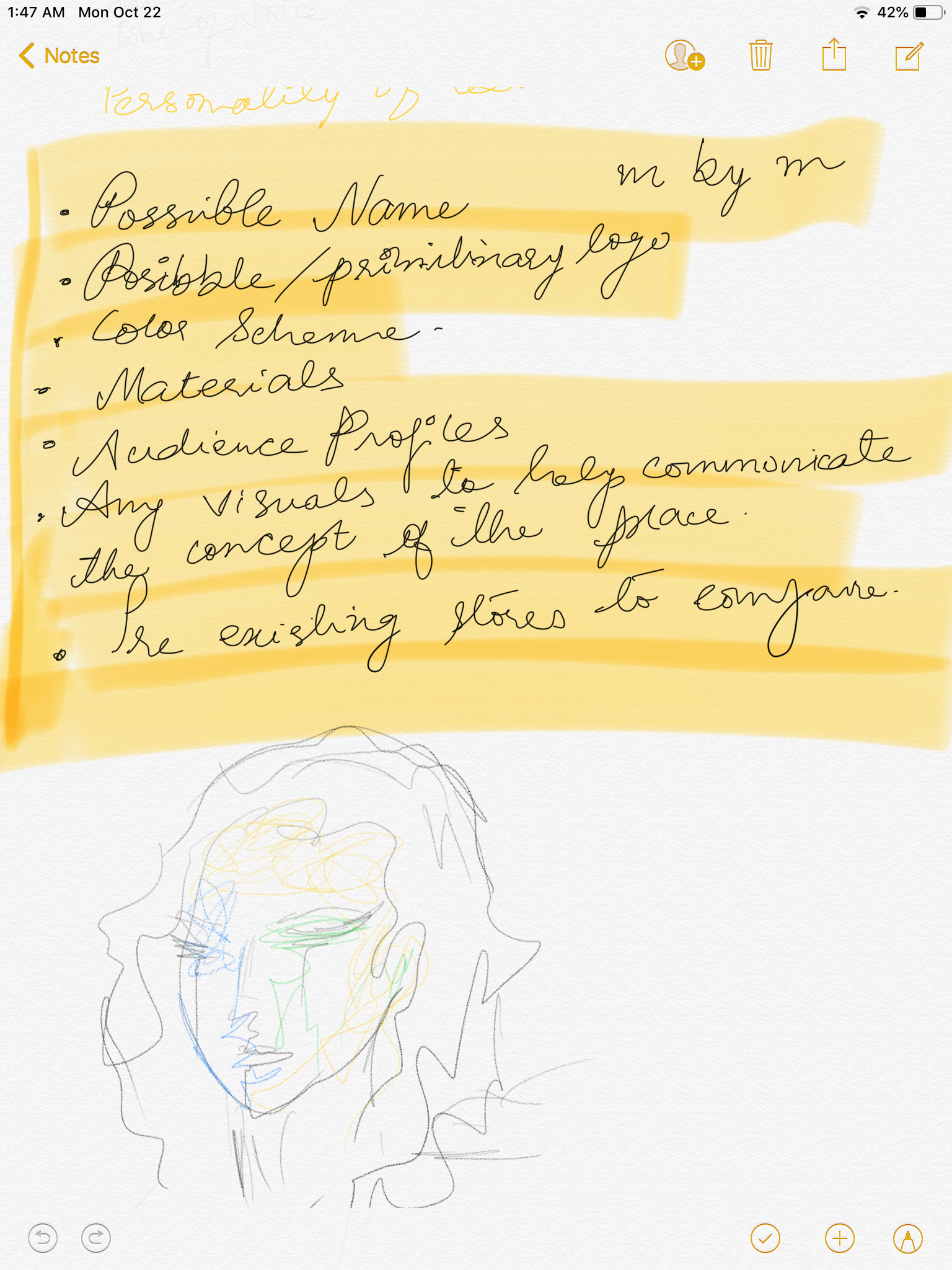
Based on the notes we came up with these points for our store.
Shop Name: Retro & Beyond
Logo: Still processing
Color scheme: Vintage and cool colors
Materials: possibly have technological and half vintage materials.
Audience Profiles: Wide audience because the idea is to welcome the past as well as the new generation.
Visuals: Half vintage and retro style half new technology
Pre-existing stores: 1990’s dinners with the latest technology.
WEEK 4
Logo
I learned that RGB and CMYK are different. I learned that RGB is better used for digital or screen purpose while CMYK is especially for print. I had to process all the new information at once the only challenge is that all this new information does not evaporate from my tiny little head.😒
Even though we use these machines, we still have to manually see and do everything. I learned what is the right way to use a clipping path and what format images should be used so that our printouts are right.
We were also told to start with our logos & these are the variations of my logo that I made.
This slideshow requires JavaScript.
However, I had so many questions because my issue was I make the logos too complicated and how simple should a logo be? Does it have to be directly related to the store etc…
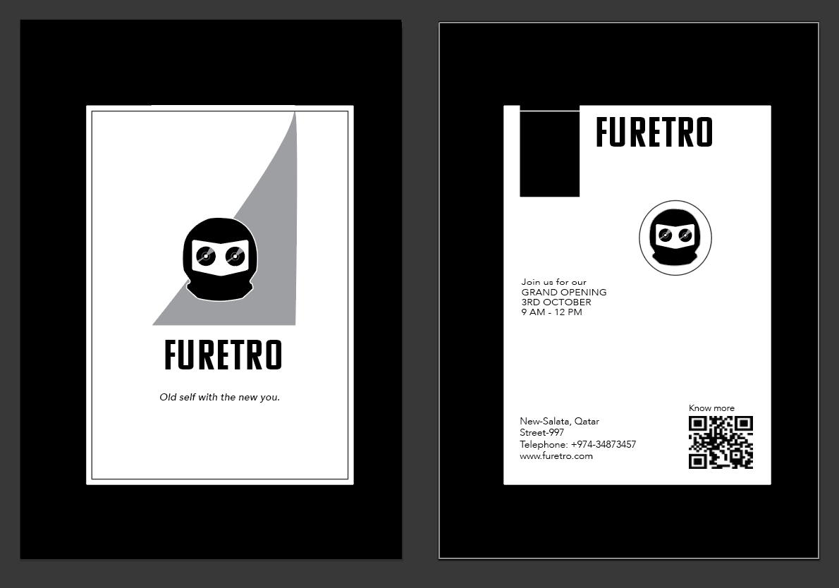
After my critiques, I was said to change the cassette in my logo because they relate too much to the past and don’t represent our store. I was also told to simplify my logo and ignore the extra edges.
This was the final one (or I thought so)
WEEK 5
Postcard
Since no one liked the cassette I changed it into CDs. I also choose a tagline ” Old self with new you”
We were supposed to make an announcement postcard for our store. I started working this way.
but learned that I did not have an image in it. Later after editing I came up with this layout for my postcard.
I had so much issue with printing because I had not set my files right. I had worked in different software and learned that we had to switch a lot between them
Illustrator- Vector-Based
Photoshop- Photos, Images
Indesign- Used for designing purpose
I achieved linking the files right and made a habit of using and naming my layers. However, I had an issue with my image size and every time I printed my crop marks would print within the image, then I realized It was better to use scanned images with 300 dpi after I did that everything was well and fine. ^_^
WEEK 6
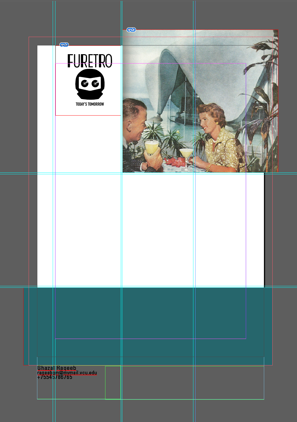
Brand manual Layout
This week I have been working on my layout for the brand manual. I started off with paragraph styles because I am a good student. 😇
As I was making my layout my first issue were the images. I was going to work in alandscape but my scanned images from the book that I borrowed my library were mostly in portrait so I had to change it back. I also had to change my grid to a portrait page.
I made a grid for my layout and set up all the necessary functions I need like bleeds, slugs etc. I made separate layers of my Images, Text, and Notes. I also made a color palette as CMYK because of course, we are going to print it.
WEEK 7
I am having a hard time with the cover page so I decided to leave it. I am thinking to add the content first.
For my “Table of Content” page I have a problem with the clipping path image. I can’t figure out how to have subtracted clipping path for my image because I don’t want the white’s underneath the girl’s arms and around her bike. I hate the yellow from our color palette it makes me puke. 🤮
YAY!
I have resolved my problem and I just had to select exclude overlapping shapes.
I learned how to make a clipping path properly and I am in love with making clipping path its just using a pen tool in illustrator and it makes a great selection of images.
I think with the brand manual I did a good job. I added all the necessary guidelines and made sure that I add to our brand’s personality in it.
so far this is what I have done! I hope other group members are also doing good.
OOH EM GII! my freaking file!… ??? like wtf my all illustrator files are missing whenever I make a package even though I am done with work sooner than anyone else some SHIT has to happen. 😒
ok, the problem was solved by the great LAW, unfortunately, I was late to submit because of this shit ai. file.
I AM NEVER SAVING ANY VECTOR IMAGES AS AI. FILES ONLY EPS NOW!
I have basically learned a life lesson not to trust ai. file anymore. 🙂
And also my crafting sucks ass!
I decided to get it cut this time from someone else but I’m not satisfied. I
Other than that I love working in the group great people except for one, yes there is always one but meh what can we do just compromise I guess. I get along with all of them, Noora is great and talented, Hamda is great too just gets distracted too soon and Maha is great too she has great sketching skills. WEEK 9
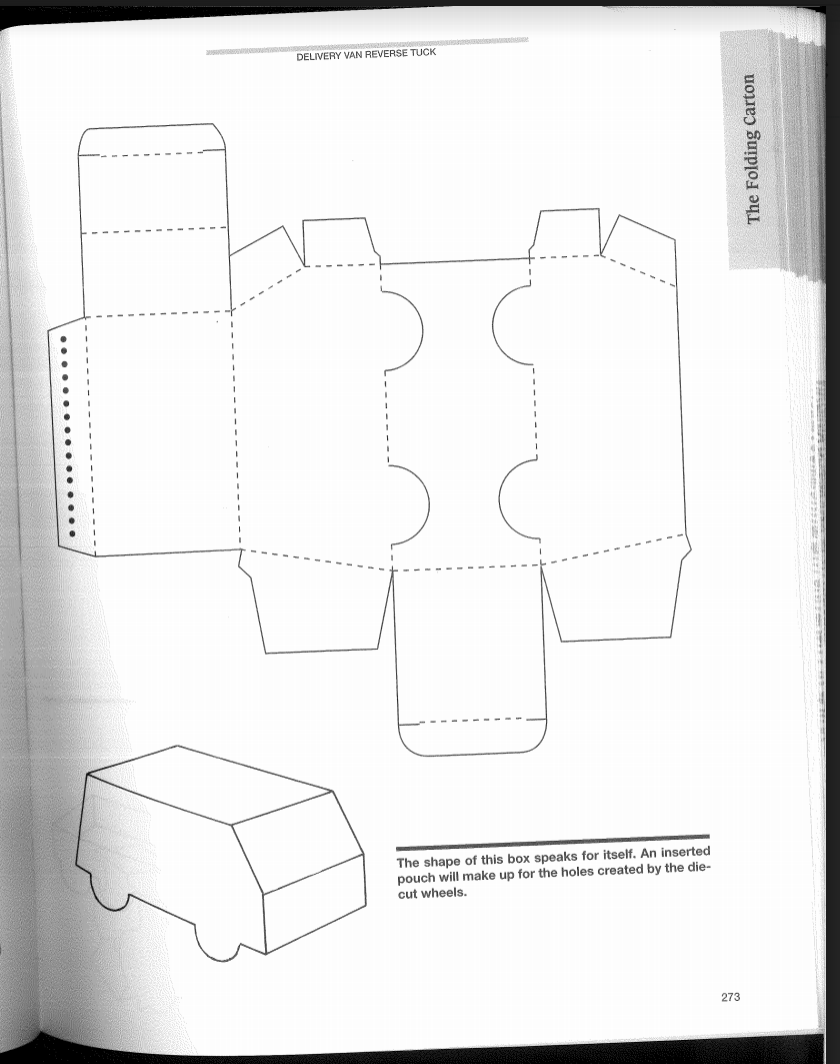
Its a start of our new project and it’s so hard to understand all these die cuts, its too much for me to take in. I think what works for me is when I record the tutorial because then I can go back to it again and again and also I am a slow learner. 🙂
The packaging looks so much fun.
I have great ideas and I am excited to learn more about it. I have an idea to add fur or print on fabric it’s so cool and exciting ❤
I am also thinking to make a package for an album cover or a CD.
so many to choose from.
ok nvm, CD’s are old people things I guess I am changing my idea to a food truck product design.
I am thinking to make it more like a spaceship food truck. Somewhat like
ok, fuck it this is too complicated it seems like its more about the files no one gives a rats ass about the design.
I think this is pretty good to work with. I decided to make my own barcode since our brand is a bit futuristic as well and has the opportunity for self-checkout, that might be a common attribute for our group packages. Noora also has amazing patterns that she made, that could be our inside part of the package.
As the time passes by we depend more and more on technology, ignoring the fact that it has made us lazy as well as exposed. I know almost all of us have social media accounts, we believe that as long as we don’t share our personal information on the web keeps us safe but let me tell you, we are not even close to being safe. Having data or information just on your computer or mobile keeps you vulnerable.
My project is about demystifying the dark web, I believe that we all should be aware of its existence. Now to further explain what dark web is,the normal web is divided into 3 parts on the surface web is where we have all the data you get through google and social networking sites then there is deep web where all the companies and universities keep their private data & information. The last one is dark web where you can access the web anonymously, this is where all the illegal activities happen eg: hitmen being appointed, drugs sale, human trafficking, human experimentation, animal abuse, executions, cannibalism, rape, child pornography, necrophilia and many horrifying illegal and inhumane activities
I came across the book by Hsinchun Chen on dark web published in 2012. I used the vcuq library by using keywords dark web. I saw that they had the book in our library and borrowed it right away. He did a research project on exploring and data mining the dark side of the web. He helped develop tools to determine and analyze the terrorism on the dark web. His main aim was to collect all the web content by international terrorist groups, including websites, forums, chat rooms, blogs, social networking sites, videos, virtual world ( by virtual world i mean games) etc.
Hsinchun Chen states that
“The internet acts as an ideal method for information and propaganda dissemination. Computer mediated communication offers a quick, inexpensive, and anonymous means of communication for extremist groups. Extremist groups frequently use the web to promote hatred and violence, This problematic facet of the internet is often referred as the dark web.
My project aims to demystify the dark web’s sites/ darknet, It will show the horrifying truth about the dark web and how people tend to take advantage of anonymity to do inhumane behaviors and fulfill their desires whereas some people tend to feel safe only when they are on the dark web because they know the normal web is being tracked and the government has full access to all our search on normal web.
My folder shows dark web world through the eyes of its users and will come across all the different activities happening around the world through what we call technology. Showing horrifying images(they are still censored) is intentional because some might not be able to go on and have the choice of closing the folder whereas some might get curious and end up being on more and more horrifying sites and users.
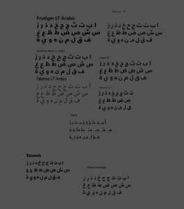
Right after downloading all the fonts, using text tool in illustrator I typed every Latin and Arabic alphabet from different fonts and stared at them for about 10 minutes. At first, they all looked similar to me but then later I started noticing their huge differences. I also made a thick stroked square with a white background to see which alphabet would blend in with other.
Even though I was pretty confident that I would be able to them properly, unfortunately, I was wrong. I faced so many difficulties, maybe it is because I am a noob. It’s so hard to keep black and white balanced and when that is balanced enough the alphabets become unreadable.
My first attempt was a huge failure but after looking at other’s work and professor’s help, I pretty much got the idea where I went wrong. I started off with latin and Latin alphabets and came up with different results
Even though they were not perfect I was glad I could at least do this much. I then started Latin and Arabic and felt like a newbie again, I realized working with different language is just like how I started with latin-latin alphabets.
Week Two
Latin-Latin
Latin-Arabic
It’s the second week and I am still struggling. I noticed that it is very hard to follow all the rules. Since I am struggling a lot, I asked one of my senior for help and guidance. I started all over again. I asked one of my senior to judge, he told me which all were wrong and how I am depending a lot on the background and how most of the alphabets are not 50% within the frame.
Latin-Arabic
Latin-Latin
Arabic-Arabic: I faced a lot of difficulties while making these
letter p, d & b
I have noticed that letter P(p) B(b) & D(d), look similar when rotated or reflected and are difficult to work with, so I avoided using these alphabets.
Week three
Final:
Latin – Latin
I used the alphabet B & Q because visually they seem to fit together. We can tell it is a B because half of the letter Q covers the letter B.
Here I used the letter S and a. S can be seen because of its curves that I had decided to show and for the letter a, there is no other letter which looks like a.
I used the alphabets K and R, they are easily detected. For the alphabet K, I decided to show its joining point and corners and R is used after reflecting it vertically.
Latin-Arabic
Here I used the letter K and Arabic alphabet ن. Here ن detaches the letter K but the alphabet K is still recognizable.
I used Latin, lower case letter “e” and Arabic letter ط. I used the already existing spaces in e and manipulated ط in it.
Here I used the alphabet “a” and Arabic letter ط. The letter a is easily detectable whereas for ط I made sure that standing line is visible because it could look like ص otherwise.
Arabic-Arabic
Here my letters are ح and و. I used و as the background letter. It could be confused between م but if looked closely م line goes to the left directly whereas for و there is spacing and makes a wide curve.
For this, I used م and ى. I used م from the font Sana so it does not have the long stick and is pretty visibleى.
I used ة and ل here. I used ة as a background because it has more curves and basically is round so that I could fit ل, which is thin.
A helpful site which tells the basic terms of typography.
Hopefully, I will know these basic terms before next project. 😛
PROJECT 002: WORD
Week four
Start of the week, we were said to type two pairs of Latin words and two pairs of Arabic words on A3 and align them accordingly. I started off by searching the meaning of every word.
bitter- having a strong and often unpleasant flavor that is the opposite of sweet.
saccharine – too sweet or sentimental
euphoric- characterized by or feeling intense excitement and happiness.
miserable- wretchedly unhappy or uncomfortable.
stultify- cause to lose enthusiasm and initiative, especially as a result of a tedious or restrictive routine.
galvanize- shock or excite (someone), typically into taking action.
dismal- depressing; dreary
cheerful- noticeably happy and optimistic.
ornate- made in an intricate shape or decorated with complex patterns.
austere- severe or strict in manner, attitude, or appearance.
chaotic- In a state of complete confusion and disorder.
tidy- arranged neatly and in order.
precise- marked my exactness
inaccurate- not correct or exact
hilarious- very funny
serious- having an important or dangerous possible result
adorable- very appealing
repulsive- causing strong dislike or disgust
fleeting- not lasting
leisurely- without haste
Next, I made notes on my chosen words
then I fixed the word by forming a solid shape in between, I realized giving them equal space made the word look horrible I also noticed that it depends on where you measure the distance from. I also made a green line so that I can see that my letters are aligned properly.
Then I wrote down my ideas for the word “adorable”
After feedback from my friend Hessa, I canceled some of my ideas because they were not working well and finalized one main idea for the word adorable.
I decided to make creepy a** doll heads. OH, MY GOD! I love it and there’s another idea of making the letter from peacock feathers which Prof. Law loves so much. I have decided to push both these ideas and see which one works better for me.
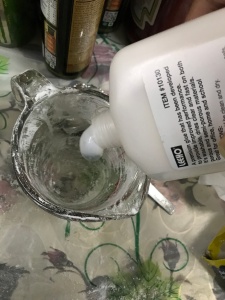
I also tried experimenting. Since my idea is about creepy dolls, I am thinking to sculpt these dolls using clay. After some research, I found out that these dolls are made of cold porcelain clay and there is a way to make it yourself so I experimented to make cold porcelain clay.
First Experiment
Ingredients:
corn flour- 1 cup
white glue- 1 cup
vinegar- 1 tablespoon
baby oil- 1 tablespoon
Mix all together and cook the mixture on low heat stove.
Unfortunately, my experiment was a failure and the dough got stuck everywhere.😣 I made the clay again and it turned out just fine. Hip hip hurray!
I started sculpting and it’s so much fun even though I cant get the look of a professional doll.
Week five
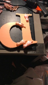
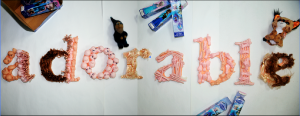
It’s week five and I have made a final decision to choose “adorable” word to experiment with and use disgusting looking doll faces. I printed out the letter “a” from the word adorable using clay which I made I made normal faces and started to make them creepy. I filled out the spaces with some disgusting insects.
Also tried the peacock feather idea, unfortunately, I did not have enough time because It took a whole day to make the doll faces so I just randomly stuck the feathers. I felt it was really hard to control the feather’s It may be because of the medium glue which In used to stick or It might be the paper, which became wet from the glue.
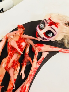
Unfortunately, after critique, I was told that it still isn’t creepy enough so I decided to use dolls to experiment with rather than making them from clearly it isn’t working.
Week six
Third experiment-
SORRY DISNEY FROZEN CHARACTERS❄️
Finally, I have reached somewhere. I had started off with something really different. I had the intention to make creepy dolls from the beginning but I was not able to bring out the effect that I wanted well no matter my failures has led me somewhere. I still find it difficult to place and fit the dolls in the letters. I think taking the letter out in physical form will be better rather than using flat letters. I might try cardboard and then fix the dolls on it. I have a lot of space left in the letters I am thinking to add small heads and fill them and with some insects.
All these are failed experiments again😭 I keep taking the wrong track. I went and asked professor again, he suggested me not try so hard to make them look creepy instead just use one of the body parts for one letter that would make it look creepy by itself.
I cut out my letter on the theromocol sheet for a strong base.
I divided the torsos to make a proper design with then, unfortunately, I don’t have enough dolls and need to buy more.
I Started cutting the base
It is really hard to fix the faces exactly on the alphabets so I still have to refine it and also the way I took photos are horrible.
Agh FML! It’s pixelated.
Week 7
I already knew what was wrong with my previous work so I tried fixing it. I took my photos again but my issue is that my word doesn’t fit in one frame so I decided to photograph them separately and edit them and save them as png.
My word still doesn’t fit in A2. When I kern them, my letters don’t fit the page and when they do my experiment with the dolls isn’t visible & I noticed that when I separately edited them they look more like digitally done.
I retook my photos again
again I could not make it fit for one photo shoot. I still had the problem of getting them together because for some reason they have different shadows even though I took them in the same light.
I tried fixing the background with healing tool in adobe photoshop, which I learned from professor Mahmoud, but I think I still don’t know how to handle the tool here.
I retook my photos again😩
& again 😒
I think this time it worked well and I can edit it to make it final.
I edited it & made the hair disappear because it looked weird and didn’t go along with the other parts.
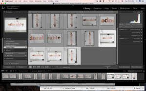
Working with Lightroom
Final
What I learned from this project is that there are fun ways to learn anything. I mostly learned about kerning and how the typefaces work. I learned that kerning the letters equally doesn’t make it work. I learned that the materials I worked with were hard to fit within the typeface but experiments helped me with that issue.
Week 8 and 9
Step One
It’s a start of week 8 and we are introduced to our new type projects. We had to choose two folded papers from four different sections.
The papers I got were
eat
visit
woefully
mother
shrill
yesterday
magazine
handsome
I came up with different sentences but I think none of them are strong enough yet.
1- Woefully handsome mother yesterday visited me & ate a magazine with a shrill voice.
2- My mother called a handsome man yesterday to visit after he ate with a shrill voice he read a magazine with his woeful eyes & left without saying a word.
3- I ate a handsome man yesterday who visited to sell a magazine with his woeful eyes but my mother saw me shrill after.
4- Yesterday my mother & I saw a recipe in a magazine how to cook a handsome guy who visited us with woeful eyes, the excitement caused me to shrill.
Step two
We were said to experiment and use the recipe given to see how our sentences would look in different typefaces, bold, Italic etc. During this phase, we were mostly told rules to follow but still, we all came up with different ways.
This made us familiar with how our sentence looks in different typefaces, sizes, style etc.
Next, we were told to type our sentence in a blank page with different ways that we could come up, I came with different experiments, unfortunately, they were so bad that I was suggested to change my major😭
In my defense, my experiments were mostly just horrible experiments and until and unless I don’t create a mess I can’t know what cleaning up or refining looks like.
some of my experiments
WEEK NINE
I was pointed out that my sentence was too long so I changed and I got my sentence fixed from my friend Yaara ❤️
Yesterday, during my handsome neighbor’s visit, my woeful mother let out a shrill & cried after reading a magazine article on how a girl ate her husband and mother-in-law.
It’s time for my greatest challenge writing this sentence in Arabic 😌
I am ready to get f&c*%^ from every side🙂 I missed one week 😫 & it’s killing me, I regret going for leadership programme 😩
I referred to some typography and I know they directly don’t relate to my project but I thought of getting some idea from them and add a little or subtract a little from them.
I found this text interesting because the first & last sentences are shorter than the middle one. Usually, we think that to make type look even it is necessary to have the first sentence longer but here Siwar Kraytem breaks that rule
before I started my work I made the grid visible so that I can use the rule of thirds.
following the rules of thirds, I started off with my sentence.
I made a red rectangle just like our first project to see the spacing between sentences and adjusted tracking.
More Inspirations
OMG!! I LOVE STAR✰..!! no, I don’t mean stars⭐️ 🌙and moon, I mean star my friend who helped me see my mistakes and gave me ideas ❤️
WEEK TEN
It’s the 10th week and I feel tired😒 I think we all need a break anyway, this week’s project is to choose a paragraph it can be anything song lyric, quotes etc. I thought of choosing song lyric.
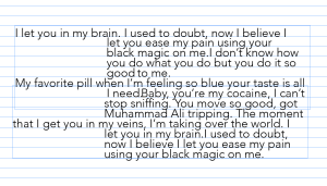
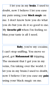
“I let you in my brain. I used to doubt, now I believe I let you ease my pain using your black magic on me. I don’t know how you do what you do but you do it so good to me. My favorite pill when I’m feeling so blue your taste is all I need.
Baby,
you’re my cocaine, I can’t stop sniffing. You move so good, got Muhammad Ali tripping. The moment that I get you in my veins, I’m taking over the world. I let you in my brain.I used to doubt, now I believe I let you ease my pain using your black magic on me.”
It’s by Jaymes Young- black magic, It’s opposite of my word “adorable”. It’s a song about love🤢😷🙄💩 (gross) but Jaymes Young has explained about love through cocaine and black magic.
I feel that for the paragraph we have more to play with. We were said to experiment with the paragraphs like before I did not just play with them and move them around here and there on the page, this time I thought deeply about placing my paragraphs on the pages. I also looked at some layouts as they helped me earlier in the sentence.
I also used the layout grid to guide me in placing the paragraphs properly.
These are the 3 best layout’s that I liked from 50.
but I know they still aren’t perfect.
WEEK ELEVEN
We had critiques and I realized how shitty my paragraphs were. We were given some guidelines to follow. I fixed all the mistakes that I had done or at least tried to. I noticed some of my paragraphs were too dark because I tried to emphasize some of my words but I totally forgot that I made the text too bold and It didn’t go the way I needed it to be.
I also am so happy he he hehe 😁 I got hand lettering guide that I wanted to get years back
I don’t feel like opening it, just wanna stare at it and appreciate the feeling of getting something you wanted.
WEEK TWELVE
We had our critiques again this week and I feel like my work is still shit. I showed my work to Mahmoud the great got some good critiques. I am in love with the right indent but he told me that little bit is okay not so much cause mine is a lot.
before
after
Also, I like these two
I think I will be using these for final.
WEEK THIRTEEN
Final
Final A4
Final A3
I decided to go with the A4 final with that specific paragraph because other one looked boring and was too basic. The other one looks more interesting to me.
Other A4
WEEK THIRTEEN
This week we were said to add all our previous projects into one. I thought It will look so ugly because I like the poster with just the word adding sentence and paragraph will make it look really ugly but I guess I was just scared to add anything on the poster. I tried setting up my sentence, paragraphs, and logo I wanted to work on In design but to my surprise, my Arabic letters were not typing in contextual form so I decided to work on illustrator.
I still worked on a grid but I was still not convinced about the placements
after the critiques, I was told that scraps of the paragraph are too close and have no breathing space and to break the sentence more also the placement of the logo. I was told by prof. Law that I have a lot of places to play with but I have crowded and everything is near the word itself.
WEEK FOURTEEN
I finally got my Indesign Arabic typing fixed. I changed the placing of paragraphs and sentence. I tried breaking the sentence into bits and tried to play with space aside from the words.
I still think there is something missing.
After the critiques, I was told to think about the leading in the sentence and also not to keep paragraph and close to the letter a. Also after Law’s suggestion and everyone’s comments, I realized I am still too close to the word also play with the piece around to place the sentence. (edit if necessary)
WEEK FIFTEEN
I edited the pieced in photoshop
and then placed the paragraphs and sentence properly
I am pretty satisfied with the placement now and I think I will use this for final. I noticed how in project 001 I had printed mine on a gloss paper and It did not look nice It was so shiny that it was hard to see the dolls so this time I printed on matte paper because my word already is a bit shiny and also because I have an empty background which looked horrible in gloss paper.
I learned so much because of type. I never thought that type would be so interesting. Experimenting was my fav part and now I see a design and type differently.My interest in typography has increased and I am really excited to learn more about typography.
As soon as we were said to bring an object which means a lot to us, I thought of using a light bulb, which was gifted to me by my dad. It has this clever way of switching it on which amused me. It switches on when you pull the rope above it. Now that’s cunning, am I right!?
My Object- OFF
My Object- ON
Step 2
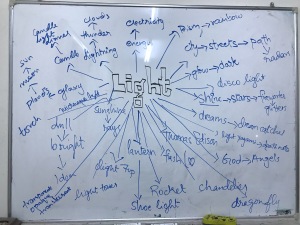
Mind Mapping-
“And now I shall unleash my creativity and potential,” said the struggling graphic designer.
I make my mind map on the whiteboard which is beside my bed so that I can keep adding my ideas.
Step 3
Create-
Now it’s time to put some action to these words!
My pairs
1)
I choose this to show action and reaction. Most of us know about the kite experiment which was conducted by Benjamin Franklin. I thought this would best suit for action and reaction as it also shows nature of lightning and electricity.
I used one cheerio for making the key and rest for eating, yummy for my tummy. I used spaghetti & butter paper for making the kite and I painted the skeleton with ranch. Talk about the best breakfast one could get!
2)
I decided to show the concept of creepy and pleasant by showing eyeball detached and a closed eye. It’s far-fetched but since the pupil dilates when exposed to light and constricts when you sniff cocaine or marijuana, now I am not saying to try it! It’s scientifically proven.
I used thermocol for the eyeball and used blue and red threads for eye nerves. To make a closed eye I cut out my makeup brush (R.I.P) for the eyebrows and false lashes. However, I am still not convinced with the closed eye, still thinking about more ideas to make it more convincing.
3)
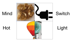
Mind and Spirit
I used walnut to resemble mind because it is the closest object which looks like a brain and for spirit, I choose a feather. I first had a white feather but it blended with the background and was not visible so I changed the color to yellow.
100 objects
Week 3
Phase 002
Step 1
It’s the third week and I have no idea where this is going. We were told to refine our best three ideas. It sounded pretty easy but as soon as I started I totally got lost again. I decided I would do it even if it is wrong because I won’t get it right until and unless I make mistakes.
Comparisons:
Reduction :: Elaboration
Concrete :: Abstract
Metaphorical :: Literal
Step 2
week 4
Step 1
We are together:
Thank God! I wasn’t the only one who could not come up with the comparisons. 😝
Our great professor Law explained us again because we are such noobs😫. This time I made sure to record and make notes so that I understand the comparisons well enough. After all the explanation it got easier to compare and refine my objects & I came up with many comparisons.
I refined my previous one after getting critiques from my friends. I changed the dew with rainbow to a diagram of a prism because it is the minimal and simplified way to show a prism and for elaboration, I choose an image of a rainbow🌈
Concrete: Abstract
Here my object was loud which led to entertainment.🎧 🎬 🎹 🥁🎮 I refined it into clubbing (don’t judge😇).I thought a television would be more thoughtful for concrete because it is more pragmatic/informative form of entertainment. For abstract, I choose an icon for theatre[ sad and happy masks] because it gives us emotions.
Metaphorical: Literal
For this, my object was eyeball but it looked way too creepy so I refined it into an eye. I choose the action of falling down in a dream and literally falling off the bed from having a nightmare.
Extra’s because having plan B is always best 😏
Step 2
Visual Statements of:
WORD:: IMAGE:: IMAGE:: WORD
my previous poor work
It’s shit 💩 I know it all too well but😂 I refined it and came out with better shit. 💩
I choose one binary opposite from my own list i.e Safe and Dangerous. I could not find the perfect image so I tangled up some wires and made it look like a brain but I got feedback from my tiny friend (Steffi) that I should change the wording because the brain can over think and it’s dangerous whereas wires have rubber on them which are insulators so they are safe. For the second, one I choose organic and mechanical. As we know hot balloons don’t need electricity and run on low intensity and according to my research low intensity is described in organic solidarity and bulb is of course described in mechanical solidarity, even a blonde knows it 😏
Extras
I had finalized my work but when i asked others, it did not make sense to them. I tried changing the images and got them better than before. I also replaced some bad images, it’s amazing how I could not see what wasn’t working well but my friends could see it.
Week 5
Made some sketches for the poster.It was not an easy task to get ideas I had to research a lot and came up with some good ideas, some ideas are too boring and too simple. I went back to look at my 100 objects and tried taking out some ideas from them.
–
Because these are too simple I tried adding into just one idea. I scanned some items to use for collage.
After using these scanned objects I came up with two different posters.
I tried adding more stuff that I scanned to make it busier, unfortunately, It still feels empty and I think next time I will put an object on the printed copy so that it looks more visual and creates more depth into one main item.
Week 6 & 7
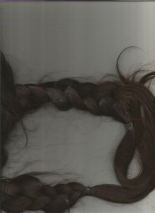
I was given a really good direction by Prof. Law about how my papers form a grid and how they could be a great start. He also mentioned to slant my text ” Let the light guide you” and told to look back at my 100 objects so I went back and stared at my 100 objects and all those sleepless nights and crying came to my mind. 😭 because of Law’s critique, I got 2 really awesome ideas in my mind. I saw how I used fake hair to make eyebrows and eyelashes and how I had eyeball which I could use for the poster.
Unfortunately, my idea to make a bulb shape with the hairs was a great failure I tried to scan my own hair but they did not have the exact shape of light bulb.
I also tried with the wig, that did not work either.
I decided to add my light bulb icon as a small punch hole for the color papers that I scanned. I also used a grid to align them as perfect as I could.
I scanned candle wax too because I used candle wax in my 100 objects
Instead of keeping the colored paper, I used other scanned objects to cover them and make them interesting
I also used LED lights that I had used for my 100 objects and changed the text because I am going to relate my object to eyes.
So I made me some more eyeballs relating to the one I already had and scanned them.
Added information and I also kept the eyeballs image capacity little low because it gives a better effect.
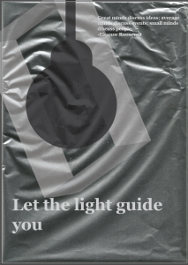
After hater-raid I was told by my friends and professor Law to change the colors because the color looks too dull, also I removed the icon on aluminum foil because it looked entirely something else. I also added one more sentence and made a little poem with the help of my friend Mo ❤ and I also added a sentence to explain my journey of 100 things.
New poster beside old one.
final on board
Final ❤️
WEEK 8
We are introduced to our new project “mapping”, even after 4 hours of explanation and lecture class I didn’t get shit! 🌝 It’s okay, nothing new. I find this project a bit difficult to understand. We were asked to get some examples of mapping and vernacular. I started my search with the cooking and baking books I have at home. I can tell that they have high vernacular because of the way it is communicating with us professionally. There is high and low vernacular my low vernacular was an advertisement of an Incubator installation.
WEEK 8
The next step of our project is to get an idea about our idea for mapping. I choose the topic recipe for myself, which means I am going to map a particular recipe. I have some amazing ideas
Ramen Noodles
Candies
Cake
Bread Now
I thought of making ramen noodles from scratch. I saw some amazing videos on how to make them, they look delicious 🤤 (my mouth is watering)
some inspirations:
Week 9
I made my own sketches for two of my main ideas
Ramen noodles
Sweet Marble (candy)
We had critiques from each other as a group. I showed them my sketches and explained my ideas in detail.
My ramen noodles are for the tired students mostly who live in dorms.
Most of the group members told me to go with the recipe of sweet marble candies because it made more sense as for ramen noodles since I will be making them from scratch It will almost be like 15 min maggie noodles, which already exists and will take time for the noodles to be made from scratch and also It is not suitable for my audience.
Week 10 & 11
I started making illustrations for my poster. I tried making my font candy-like. Since my recipe is candy I thought that I could relate it to one-piece, the character tony chopper, who is very fond of candies
FINAL
I even tried to make a toy of my new character but unfortunately, I slept and never woke up 🙁
Week 12
Group Work:
It’s the start of our new project “project:003”. I love how it is quite open and we are supposed to come up with a performative exhibition but its a group project. 😒
We watched the movie in a class and Prof.Law told us to form groups
We all decided to watch the movie “The red balloon” individually because someone was busy.😐 We all took notes and talked about the relationship which we were most interested in individually. We did not have much interaction with each other than deciding about watching the movie individually. I wanted to watch the movie together but no one was willing to give time other than Kainat and Moe. We all made the group in WhatsApp so that we can text each other when we watch the movie and have a discussion on the movie.
Individual contribution:
My notes-
I found the feelings of ballon very interesting. I wondered how the ballon must have felt because at some point the balloon controls/decides itself to be with the boy.
I thought of making a bakery commercial because after watching the movie I noticed that’s how the boy gives priority to pastry and leaves the ballon & that’s when ballon gets taken away. I thought of making illustrations and animate them. I was suggested by Steffi to make them as a flipbook, I still wasn’t sure because I couldn’t still relate it to what others had.
THIS IDEA GOT REJECTED TOO! 😣
I even had my research on this idea and thought of making a funny live-action advertisement ( but it turns out I’m not that funny) LOL
Research:
WEEK 13
Group Work:
we all had our mood boards and were ready to go with our ideas. We shared our ideas with each other and had critiques of what works well and what does not.
Then we had a talk with professor and Fatima, we decided to make commercials, Its was mostly Moe’s idea to make a commercial for perfume or bed for an imaginary friend, so we all decided to make commercials for products unfortunately, I struggled with it everyone had a product to show I guess mine wasn’t strong enough so I had to keep changing.
We all (or at least they) had their ideas fixed on what to make.We decided to choose our mediums and our product to commercialize. We still discussed more ideas. I thought of asking others to help me get my idea but I guess not! 😕 Anyway, my idea should be of my own’s. Kainat helped me with coping with the idea, she told me to go through my notes and think deeply how I can connect it with our idea.
We then discussed the positioning of our products and how the spacing would work out. We decided to present our exhibition as a museum and place our products on pedestals. We changed a lot of time because of the pedestal available and TV’s size.
Individual contribution:
I finally decided to make a commercial on counseling so that it can be in relation to rest of the commercials. I am thinking to make a business card as well for a psychiatrist. 😇 I think working with a group I will need an actual psychiatrist as well because our group is in a chaos 😌
I feel many good ideas (not just mine but everyone’s) were shut down from each other for no reason. Anyway moving on I have decided to make animation style commercial getting inspired by Psych2Go.
I think it is a risk to work with animation because it is very time-consuming and the will have to make a lot of frames. I thought of making stop motion but that is way too risky I am a noob.
Lol, I was so excited to note down the principles that I did not realize exacto blade fell on the sofa and I got stabbed in my leg. I did not realize it until I saw a pool of blood on the ground that🔪 freaked me out so much because it started bleeding more and more when I tried to move.
Lovely accident 😒
However, I think I’m fine now
I made so many frames for my animation 😩 It was pretty frustrating because one simple mistake I had to go back and change everything. It turned out to be okay-ish though. Then I started thinking about the script. I did my research and read many articles related to depression ( which killed me and made me extra depressed than usual) I also asked and discussed this topic with people who actually are dealing with depression other than me.
Script:
I did my business card ❤
added this illustration of a sad french girl sitting thinking how she is so alone because everyone is two-faced bi@+C#
I was told I still have lot to fix and add the audio since Law does not like appreciate the early death of over pooping 💩 I changed that scene into a skeleton but I did not use it because my video was more than our time limit given to us individualy and I did not want to take other group members time.
WEEK 14
GROUP WORK:
We all worked on fixing the setup. At this point, everyone was freaking out! 😶😵
We all decided to work on our commercials as well. We started painting the walls and pedestals. We still had our commercial to work on because no one was yet done except for Kainat. Steffi wanted to cut out vinyl which I was against it because I thought of having the description cut on a paper and pasted it on hard cardboard (wood or plastic) but since everyone was using vinyl, mine would look different so I sent the description. We failed with the vinyl cutting 4 times, I think because the typeface was very small and thin.
FINAL
FINAL VIDEO
WEEK 15
I learned that having friends in your group sucks 🙄 I learned that deconstruction can be any way we want. It is not necessary to be on point, deconstruction can turn out to be deeper if organized well.
I also learned that while working in a group it is better to assign responsibilities in the beginning so that there is no confusion also help others resolve any issues that come while working.


 Also tried the peacock feather idea, unfortunately, I did not have enough time because It took a whole day to make the doll faces so I just randomly stuck the feathers. I felt it was really hard to control the feather’s It may be because of the medium glue which In used to stick or It might be the paper, which became wet from the glue.
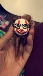


 I also used LED lights that I had used for my 100 objects and changed the text because I am going to relate my object to eyes.
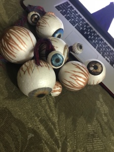 So I made me some more eyeballs relating to the one I already had and scanned them.


 New poster beside old one.
 final on board
 Final ❤️


